A blog about books, brands, films and exhibitions... and quite a lot about paintings...

Monday 1 October 2012

More paintings...

I've been doing a few more paintings, Nicholson inspired, but this time on square canvases. I went to an art shop just outside Holland Park the other day and bought some tiny canvases for £1. That's what I'll be painting next. I should probably try and paint something other than flowers... 


Sunday 2 September 2012

Winifred Nicholson

Flowers bursting out of vases, check table cloths, bowls of strawberries and curtained window views. Winifred Nicholson's paintings all appear to be plucked from idyllic domestic interiors. Her colour palette complimets with touches of lemon yellow, rosey hues and soft pale blues. There is nothing dark about these paintings, nothing angular or harsh. 

Yet while they might belong to a powdery feminine landscape (Victorian ladies dabbling in charming still lives) Nicholson does something bold in her work. She reinvents the traditional floral scene, imbuing it with her own abstract style and acute sense of design. 

Studying for my Master's at the Courtauld I found that Winifred was, perhaps inevitably, overshadowed by her more radical husband Ben Nicholson - before he ran off with the St. Ives sculptor Barbara Hepworth. His fractured collages and stark modernist simplicity earnt him much applause and whimsical Winfred was often left behind. Despite this, it is her work that appeals to me and, now I'm working at Sotheby's, I've had the chance to inspect it up close and see just how vibrant it really is. 

Below I've had a go at recreating her painting style, taking inspiration from a work Sotheby's recently sold titled Alwoodii Pinks in a Glass Vase (1930) along with Penstemons (1927) and Helen's Flowers (1970s). I wrote about Penstemons (the middle one) in my thesis briefly - I think I was interested in the shadow...


Saturday 7 July 2012

A Shower of Poems

Flickering in the light like magic tickets. They tumbled out of the air. People raised their arms and jumped and tried to catch the tiny slips of paper. Like catching a bouquet at a wedding.

On the pieces of paper were poems. Poems written by poets all over the world.

They were let go from a helicopter on the evening of the 26th June. They fluttered down from the sky and landed on London’s Southbank. Like a parcel of food flung from a plane they felt like little presents. I wasn’t there to catch one, but I was sent a poem in the post. 


Friday 6 July 2012

The Guardian Advert

Three Little Piggys.
And a Big Bad Wolf.

Everybody knows the story. Everybody knows the end.

It’s a tale we hear at bedtime, one we’re told at school. Full of huffing and puffing and chinny chin chins. Of Wolves blowing down houses in an attempt to get in.

Instead of re-telling the tale the Guardian, in their new advertising campaign, has imagined how we might cover the story in print and online. Bringing it into a contemporary context the advert shows how –with the Guardian involved– a familiar story can lead to an unexpected conclusion…
In the Guardian’s advert the piggys are still present, as is the Wolf, but the events that unfold are drastically different. Roles are reversed, baddies and goodies muddled up.

The Big Bad Wolf becomes the hapless victim, the cute little pigs the perpetrators. And the story isn’t set in stone; it shifts with the views of the public. As people text, type and tweet new avenues open up; different points of view unravel and reverse.
Rather than be dictated to us, the story is shaped by us. 
Cleverly The Guardian positions itself as a newspaper that listens to its readers, and by doing so, discovers the truth. A truth that others have missed.

But the message doesn’t stop there. The Guardian goes one better. In possession of the facts its readers don’t simply sit back and relax, they act. Empowered, the Guardian readers campaign for change.

In the Guardian’s advert the paper proves itself to me a master story teller – finding the truth, sparking debate and stirring action.

This fairy story, with a twist, packs a powerful punch.

Monday 11 June 2012

Sisters...


Perhaps it is heresy and perhaps I shouldn’t say
But there’s something I’ve been thinking on all this Jubilee Day
The scheming Boleyn sisters, their cunning and their wit
The way they reeled the Great King in, bit by tiny bit.
One sister set the scene, pure innocence and charm
The other was more risqué, a cause for Royal alarm.
Their parents were social climbers, the brother was in it too
Do you see where I’m going with this, do I need to spell it out to you?
The Middleton sisters are not quite the Boleyns
They’ve only ensnared a Prince, and failed to catch a King…
But Pippa’s moving in Kate, her bottom caused a stir
At your Royal Wedding, all eyes were on her!
So make sure you snip it in the bud
And lop off her pretty head
Or else – as your Tudor pals would warn you
It’ll be her in William’s bed!

An Ipad Drawing: David Hockney did it, so I thought I'd give it a go...


Thursday 7 June 2012

The Diamond Jubilee


I guess it is a well-worn story
A Queen, a kingdom, pomp and glory.
But, really, this Jubilee weekend?
I cannot help it, I shan’t pretend!
Was it not a right royal flop?
Were you not wanting it to stop?
What was the point of all those boats?
Yes, very nice, I see they float.
But chugging down the Thames like that
They just looked sad and pretty crap.
Beneath the clapping and the shouts
Queeny was screaming ‘LET ME OUT!’
She wished she wasn’t on that barge
Badly painted, garish and large.
Just take a look at her little face
(I’m sorry; I really am your Grace)
But the whole time you looked furious
Not surprised, in awe, nor curious…
They said it’d be like Canaletto
I doubt he’d paint that rainy boat show…


At last, after her day of dread
The Queen went home, and so to bed.
The Nation had had their Royal fill
Prince Philip was feeling rather ill.
You’d think we’d let them off the hook
And not demand another look!
But her royal subjects aren’t that kind
No, we had something else in mind!
‘Whoopee!’ A party at the palace
Ha Ha, we’ll pay you back with malice!
For all your jewels and posh buffets
We’ll make you sit through Jessie J!
And I’m sure I saw you wince
When, oh god, you heard your Prince
You tried your best, he went to school
Perhaps he was just born a fool…
When, oh yes, he called you ‘Mummy’
Something stirred within my tummy…
What the heck! Is this for real?
This man, this Charles, might someday kneel
Before you and be crowned our King
What a shocking, dreadful thing!
You might be old, and want to quit
To pack it in and learn to knit…
But please, Your Highness, don’t step down
There’s no one else to wear your crown…
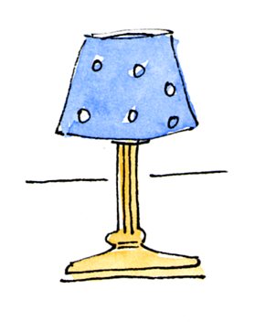


Friday 9 March 2012

David Hockney: A Bigger Picture

It’s a dull day in London. Traffic rolls noisily beneath a pale grey, empty sky. 

The streets are crowded with office workers, slick suits and February’s frowning faces. 

Winding into the Royal Academy is a small queue.

There are old men wearing flat caps and old women, in fancy hats, and the occasional young person, dressed in scruffy, art school stripes.

Coming out of the Royal Academy are smiles. Lots of smiles.

David Hockney’s ‘A Bigger Picture’, it seems, is putting a spring in people’s steps.

The exhibition, showcasing Hockney’s recent work, is a jubilant expression of beauty. Vast and vivid it captures the English countryside -patch work fields and rolling hills.

Huge canvases stretch across white washed walls. Multi-panelled paintings of psychedelic woodlands, emitting their own bright light. 

Spin round the room and you flick through the seasons. Frosty blues and icy greys morph into spring’s pale pinks and summer’s rich yellows.


It is bold and contemporary. Traditional landscape painting with a modern twist. 


In Hockney’s hands technology sparkles. In one gallery giant iPad drawings fill the space. The delicacy with which Hockney has conjured up these digital drawings is incredible. Tiny tracings of a scribbled line, the threads of a brush stroke. It is all there.

Hockney’s film work is just as thrilling –multiple cameras (ingeniously rigged on to his Jeep) move like multiple eyes along leafy country lanes. In creating these shifting, kaleidoscopic jaunts Hockney throws out time frames and plays with perspective. 

Nothing in the exhibition is quiet, nothing sits still; it is alive, excited, exuberant to the point of bursting. 

Blazing oranges, streaks of viridian – straight from the tube, dashes of violet and acid pink swell together, rising in energetic crescendos.

 I’d definitely go again… if the tickets weren’t so expensive.
‘A Bigger Picture’ is on at the Royal Academy until the 9th April.

Wednesday 7 March 2012

What happened to Habitat?

Paper lampshades. Modernist chairs. White washed walls and an air of Scandinavian simplicity.
 
Habitat was once the leader in contemporary design. With his artful eye and designer’s intuition Terence Conran ensured that each object was expertly crafted and beautifully finished. The space was sparse, angled spotlights circled individual products, and in its Bauhaus chic Habitat appeared to effortlessly conjure a sense of ageless modernity. Customers flocked, eager to purchase a piece of functional design.

In 2011 Habitat went into administration and all but three of the stores were rushed off  the High Street.

Habitat no longer stood as an icon of the comfortable middle classes, instead the brand had become confused, lost somewhere between the extremes of Heal’s and Ikea. The art school roots had dried-up and its inventive streak had been replaced by row upon row of products that could have been found anywhere and at a fraction of the price.

The fate of Habitat isn’t unique. Stores across the country are finding it increasingly difficult to compete with the rising elite of the online mega-shop. After all prices are cheaper and it’s quite a lot easier – one click of the mouse and no need to leave the
house.

In order to combat the competition the High Street needs to capitalise on what it has – a premium space in the centre of a city. The Habitat stores once laid out a design-fuelled vision which customers were keen to experience. Somewhere along the way this disappeared. Though it is not the only factor to staying afloat, the stores that do still offer an experience seem to be surviving. 
Liberty, situated in the heart of London, is a perfect example. To walk through Liberty is to be plunged into the thick of things. From the very beginning we are bombarded with a heady mixture of delights for the eye. The Tudor-esque frontage, the buckets of Lilacs and Lillies, the Christmas displays, dazzling with sequins and velvet, all mingle to create a flamboyant and compelling spectacle. Once inside, the dark wood panelling, the uneven floors and  metres of materials, together with the sparkling cabinets, continue the
charm.

The store conjures, however fleetingly, a glimpse of the past. It actively embraces its traditional qualities, playing upon its heritage and history, its links with William Morris and the Pre-Raphaelites. However flashy the new online sites might be, the experience that the Liberty store offers is something they cannot capture. It is this experience that sets Liberty apart, that makes people want to visit it and thus ensures its future.
In Sotheby’s recent rebranding they have worked hard to exploit the value of the Sotheby’s experience’, in order to directly counter online competition.

Similar to any other store Sotheby’s, as an auction house, is now in competition with online auction companies. In the last few years Chinese online auction sites have been popping up and eating up a fair chunk of Sotheby’s market. Undercutting with their minimal commission Sotheby’s has had to strike back. New marketing material, short films and arty photographs are suddenly being commissioned left right and centre. The aim is to promote the exclusive experience that Sotheby’s offers. 

In these short films the camera focuses in on the drama of an auction, the electric atmosphere, the frowns and the claps, the laughs and the gasps. From the champagne bottles to the wooden clack of the gavel as it comes down on another world record, it is all there, luring the customer in. It is a complete performance, but one that is thrilling to participate in and one that you cannot fully experience sitting in front of a screen.

What makes the experience even more appealing is that it is steeped in tradition; there are doormen standing beneath the billowing flags at the entrance, sweeping staircases, high-ceilinged rooms, ornate furniture. It is almost like a time capsule from another era, tapping into our sense of nostalgia.

In a market that is constantly changing, and highly unpredictable, this obvious heritage marks Sotheby’s out and is certainly the reason behind the recent change of the logo, from sans-serif to serif. Though it seems insignificant, the simple adding and subtracting of tiny lines, this change recalls Sotheby’s past, hinting at its wealth of experience. In addition to this it reminds customers of Sotheby’s longevity and its steadfastness in an unpredictable economic climate.

In a world that is becoming increasingly virtual, where things are only seen behind glass, where it is all at one remove, the first-hand experience is becoming increasingly sought after.

Brands that use the space they have to provide an experience, and therefore a reason to visit, stand a greater chance of succeeding. Brands that don’t, such as Habitat, might find they lose their way.